Lender Sees Promising Returns on New Digital Presence
The challenge.
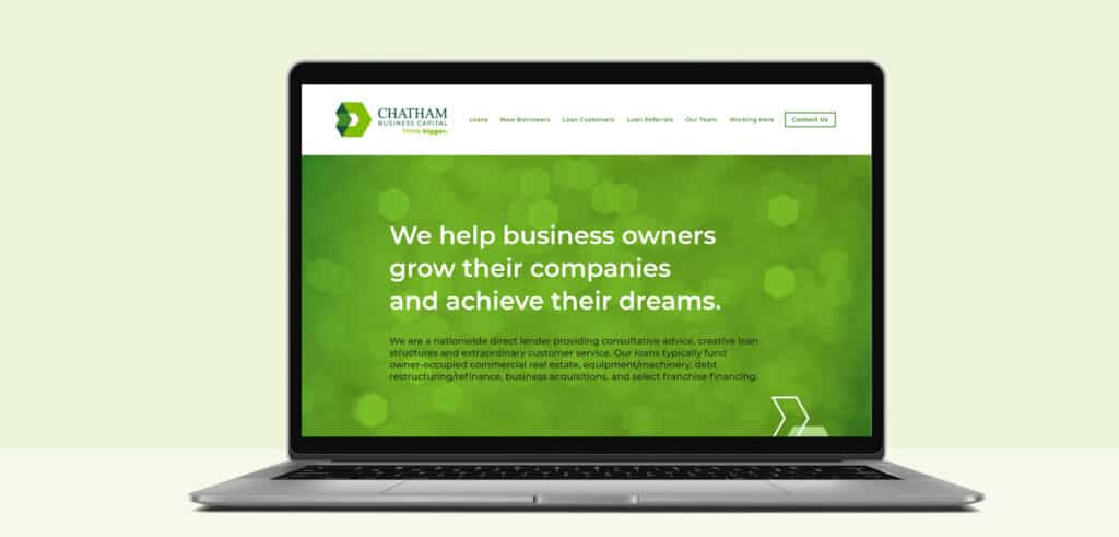
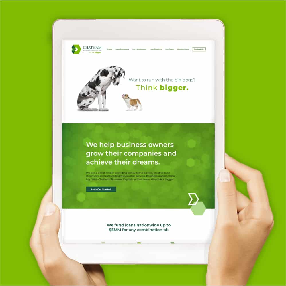
As a direct lender, Chatham Business Capital helps business owners grow their companies, get to the next level, and achieve their dreams. The lender needed an online presence to expand its reach, but a conventional website would not do. Chatham takes a different approach than conventional banks and needed a digital presence that would reflect their creative and personable style.
The strategy.
- Website Design + Development
The results.
Chatham Business Capital has a responsive site that differentiates the lender from both its parent company, First Chatham Bank, as well as its competitors. Based on positive feedback and strong traffic numbers, the site is resonating with its key audience: small-business owners.


Take your marketing to the next level.
Want more? Get our strategic insights and marketing tips delivered to your inbox.
By submitting this form, you are consenting to receive marketing emails from: The Marketing Collective. You can revoke your consent to receive emails at any time by using the SafeUnsubscribe® link, found at the bottom of every email. Emails are serviced by Constant Contact

